Wondering if anyone else has noticed this. Having upgraded to the latest viewer I was quite, mm how to put it.. disgruntled to find that the font used in script windows has changed. It's now some big, ugly font that takes up more space per character then before and just annoys me.
Anyone else see this or is this a my pc screwed up kinda thing?
Welcome to the Second Life Forums Archive
These forums are CLOSED. Please visit the new forums HERE
New Font |
|
|
Lylani Bellic
Evil Genius
Join date: 2 Jul 2008
Posts: 42
|
07-09-2009 03:36
|
|
Dekka Raymaker
thinking very hard

Join date: 4 Feb 2007
Posts: 3,898
|
07-09-2009 03:42
I have seen other people complain about this.
|
|
Viktoria Dovgal
…

Join date: 29 Jul 2007
Posts: 3,593
|
07-09-2009 03:48
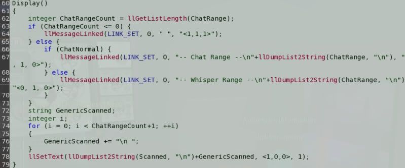
Yes, it's a new font. The old font was missing a lot of characters so a new one was kind of needed. Unfortunately no one seemed to notice that it's a lot bigger at the default nominal 9 points than the old one was.
In your Second Life app folder, find skins/default/xui/en-us/fonts.xml and open with a text editor. Scroll to the bottom and you will see the font_size tags. Try setting the entry for Monospace to around 7.0 instead of the default 9.0, save, restart SL to see the changes. Lather, rinse, repeat until you find a size that works for you. It would be nice if there was something in the SL interface for this, but there isn't. (There were debug settings for this but they no longer work, the sizes were moved from settings to the skins.) |
|
Lylani Bellic
Evil Genius
Join date: 2 Jul 2008
Posts: 42
|
07-09-2009 03:51
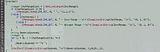
Visual reference:
Old Font http://i15.photobucket.com/albums/a373/Dyo_K/th_OldFont_001.jpg and New Font http://i15.photobucket.com/albums/a373/Dyo_K/th_NewFont_001.jpg And thanks for the tip on how to change it! Edit: Size 8.0 looks closer to the old size but it's still a different font and will bug me. |
|
Infrared Wind
Gridologist

Join date: 7 Jan 2007
Posts: 662
|
07-09-2009 05:56
Yes, the font change irked me too as I spend a lot of time in the
scripting window. I've found that setting it to 7.2 makes it about the same size as before, but as nice as the new font is, it's not as nice as the previous font (at least I'm not used to it). I would love to know the PERSON'S name who made this decision. lol Bet they don't do much in-world scripting. But here's what I did to make it exactly like before: In the fonts directory I renamed DejaVuMonoSans.ttf to DejaVuMonoSans.ttf.original Then I made a copy of profontwindows.ttf (which was the font used before) and named it DejaVuMonoSans.ttf. I then edited the fonts.xml file that Viktoria mentions above, and changed the size to 9.0. Now the font in the script editing window is exactly as before. - Infrared _____________________
 |
|
Argent Stonecutter
Emergency Mustelid

Join date: 20 Sep 2005
Posts: 20,263
|
07-09-2009 06:34
Visual reference: Old Font http://i15.photobucket.com/albums/a373/Dyo_K/th_OldFont_001.jpg and New Font http://i15.photobucket.com/albums/a373/Dyo_K/th_NewFont_001.jpg _____________________
Argent Stonecutter - http://globalcausalityviolation.blogspot.com/
"And now I'm going to show you something really cool." Skyhook Station - http://xrl.us/skyhook23 Coonspiracy Store - http://xrl.us/coonstore |
|
Cerise Sorbet
Registered User

Join date: 8 Jun 2008
Posts: 254
|
07-09-2009 07:09
  Do I get a cooky? |
|
Infrared Wind
Gridologist
Join date: 7 Jan 2007
Posts: 662
|
07-09-2009 07:15
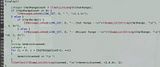
Can you provide links to the actual images? Those are thumbnails. Somebody already did this, but I've added some extra info: Before: profontwindows.ttf set to 9.0 points  After: DejaVuSansMono.ttf set to 9.0 points  Besides the size difference, notice the font difference. For example the lower case 'l' (L). -iw _____________________
|
|
Infrared Wind
Gridologist
Join date: 7 Jan 2007
Posts: 662
|
07-09-2009 07:18
Do I get a cooky? You almost got a cookie, but you blew out the width of the thread! lol -iw _____________________
|
|
Argent Stonecutter
Emergency Mustelid
Join date: 20 Sep 2005
Posts: 20,263
|
07-09-2009 07:23
Thanks, the new font is definitely a lot more readable. I like the DejaVu family quite a bit.
Still not going to upgrade to 1.23 just to get it.  _____________________
Argent Stonecutter - http://globalcausalityviolation.blogspot.com/
"And now I'm going to show you something really cool." Skyhook Station - http://xrl.us/skyhook23 Coonspiracy Store - http://xrl.us/coonstore |
|
Infrared Wind
Gridologist
Join date: 7 Jan 2007
Posts: 662
|
07-09-2009 07:33
Thanks, the new font is definitely a lot more readable. I like the DejaVu family quite a bit. Still not going to upgrade to 1.23 just to get it. DejaVu is OK. But are you saying more readable because it's larger? Or because of the design of the font? - Infrared _____________________
|
|
Argent Stonecutter
Emergency Mustelid
Join date: 20 Sep 2005
Posts: 20,263
|
07-09-2009 07:42
DejaVu is OK. But are you saying more readable because it's larger? Or because of the design of the font? _____________________
Argent Stonecutter - http://globalcausalityviolation.blogspot.com/
"And now I'm going to show you something really cool." Skyhook Station - http://xrl.us/skyhook23 Coonspiracy Store - http://xrl.us/coonstore |
|
Darien Caldwell
Registered User

Join date: 12 Oct 2006
Posts: 3,127
|
07-09-2009 08:40
Someone else I know complained about this to me, but It never happened on my machine. I guess I'm lucky. Not that I would probably complain, bigger font is easier on these eyes of mine.
") _____________________
|
|
Katheryne Helendale
(loading...)

Join date: 5 Jun 2008
Posts: 2,187
|
07-09-2009 12:46
DejaVu is OK. But are you saying more readable because it's larger? Or because of the design of the font? - Infrared I find the design of the DejaVu font family to be better - particularly with the lower-case Ls. I can't count the number of times when I was learning scripting that I had confused the lower-case Ls with Ones. I also don't have a problem with the new font size, either. It definitely makes the script easier to read and follow. I don't run SL in a tiny window, so the font size doesn't matter much to me. Larger text = easier to read code = fewer programming mistakes. _____________________
Of course, its all just another conspiracy, and I'm a conspiracy nut. Need a high-quality custom or pre-fab home? Please check out my XStreetSL Marketplace at http://www.xstreetsl.com/modules.php?name=Marketplace&MerchantID=231434/ or IM me in-world. |
|
Katheryne Helendale
(loading...)
Join date: 5 Jun 2008
Posts: 2,187
|
07-09-2009 12:52
But here's what I did to make it exactly like before: In the fonts directory I renamed DejaVuMonoSans.ttf to DejaVuMonoSans.ttf.original Then I made a copy of profontwindows.ttf (which was the font used before) and named it DejaVuMonoSans.ttf. I then edited the fonts.xml file that Viktoria mentions above, and changed the size to 9.0. Now the font in the script editing window is exactly as before. - Infrared _____________________
Of course, its all just another conspiracy, and I'm a conspiracy nut. Need a high-quality custom or pre-fab home? Please check out my XStreetSL Marketplace at http://www.xstreetsl.com/modules.php?name=Marketplace&MerchantID=231434/ or IM me in-world. |
|
Dytska Vieria
+/- .00004™
Join date: 13 Dec 2006
Posts: 768
|
07-09-2009 12:52
You can change the font sizes by editing the fonts.xml file found in C:\Program Files\SecondLife\skins\default\xui\en-us Location may vary depending on the skin and language you use.
Look at the bottom of the file. I only changed my Monospace font to 7.5, the rest I left alone. _____________________
+/- 0.00004
|
|
Milla Janick
Empress Of The Universe

Join date: 2 Jan 2008
Posts: 3,075
|
07-09-2009 13:02
I dig Ransom Note.
 _____________________
 http://www.avatarsunited.com/avatars/milla-janick All those moments will be lost in time... like tears in rain... |
|
Argent Stonecutter
Emergency Mustelid
Join date: 20 Sep 2005
Posts: 20,263
|
07-09-2009 13:07
 _____________________
Argent Stonecutter - http://globalcausalityviolation.blogspot.com/
"And now I'm going to show you something really cool." Skyhook Station - http://xrl.us/skyhook23 Coonspiracy Store - http://xrl.us/coonstore |
|
Darien Caldwell
Registered User
Join date: 12 Oct 2006
Posts: 3,127
|
07-09-2009 13:25
I dig Ransom Note. Ouch! _____________________
|
|
Infrared Wind
Gridologist
Join date: 7 Jan 2007
Posts: 662
|
07-09-2009 19:02
Silly question, I'm sure, but - if you're already going to be going in and editing the fonts.xml file, why go through the trouble of copying and renaming fonts? Simply change it in the XML file and be done with it. That would work. -i _____________________
|
|
Lylani Bellic
Evil Genius
Join date: 2 Jul 2008
Posts: 42
|
07-09-2009 19:15
But here's what I did to make it exactly like before: In the fonts directory I renamed DejaVuMonoSans.ttf to DejaVuMonoSans.ttf.original Then I made a copy of profontwindows.ttf (which was the font used before) and named it DejaVuMonoSans.ttf. *hugs* Thanks a bunch  Edit: I noticed that the font (profontwindows) was not existent in the fonts folder anymore I had to copy it from the old install I still had before I could use it. Changing the XML without copying the font over before hand wouldn't work. By that point, imo, may as well just rename the fonts. |
|
SuezanneC Baskerville
Forums Rock!

Join date: 22 Dec 2003
Posts: 14,229
|
07-09-2009 20:31
Here's are some links on fonts for programming:
Some folks like Pragmata: http://www.fsd.it/fonts/pragma.htm Monospace/Fixed Width Programmer's Fonts : Monospace/Fixed Width Programmer's Fonts A chart with samples for easy comparison: http://www.darinhiggins.com/CategoryView,category,Fonts.aspx The author of the above chart suggest Consolas. Programming Fonts: http://keithdevens.com/wiki/ProgrammerFonts I've wanted a font that goes out of the way to make periods distinguishable from commas, regular parentheses distinguishable from curtly braces, and so on. Here's a font that takes that idea to an extreme: Oloron, available at: http://www.fontmenu.com/site/_program.html There's a font called ti92pluspc that looks like it might be worth looking at but the url given for it is not longer valid. Anyone see a source for it? If anyone knows of a suitable font that exaggerates the punctuation marks about two tenths as much as Oloron does I'd like to know and I'll bet some of the people with more impaired vision than mine could benefit as well. _____________________
-
So long to these forums, the vBulletin forums that used to be at forums.secondlife.com. I will miss them. I can be found on the web by searching for "SuezanneC Baskerville", or go to http://www.google.com/profiles/suezanne - http://lindenlab.tribe.net/ created on 11/19/03. Members: Ben, Catherine, Colin, Cory, Dan, Doug, Jim, Philip, Phoenix, Richard, Robin, and Ryan - |
|
Sayrah Parx
Registered User
Join date: 16 Jul 2008
Posts: 17
|
08-22-2009 14:56
I would love to know the PERSON'S name who made this decision. lol Bet they don't do much in-world scripting. But here's what I did to make it exactly like before: Thank you, I looked at the XML file but had no idea if changing anything would do any good. I just started using Snowglobe again, and the font was one of the reasons I went back to 1.22 before. I'm editing scripts all the time, so I would go crazy if I had to use the new font! I also replaced the pie menus with the ones from 1.22. So now I can actually do stuff using the latest viewer and enjoy all the improvements. Thanks again! |
|
Czari Zenovka
I've Had it With "PC"!
Join date: 3 May 2007
Posts: 3,688
|
08-24-2009 06:42
Ok, this may seem like a silly question, but it may be related. I have used an old viewer with Nicholaz forever. Just to see what the current viewer is like, I downloaded it. While I had both SL and my browser open, I leaned forward and accidentally pressed one or several keys on my keyboard. (No idea which one/s.)
The first thing I noticed is that the text on my browser toolbars have different font - thinner, fainter and with almost a bit of a shadow on it. This carries through to the drop down menus for any of the selections such as Bookmarks. I researched, reloaded my browser, went back to a past restore point (Windows XP), etc. and nothing worked. This morning I realized I was getting this same text within SL on my notecards, even those previously written. The current viewer was deleted with the restore point but my strange question is: Would having installed the current viewer changed all the above? Or was it the pressing of some mystery keys on my keyboard. And if the latter is true...how did it manage to change text on my browser AND within SL? I hope this makes sense and someone can help...I spent most of yesterday and last night trying to correct this. Thank you in advance. _____________________
*Czari's Attic* ~ Relive the fun of exploring an attic for hidden treasures!
http://slurl.com/secondlife/Rakhiot/82/99/111 During times of universal deceit, telling the truth becomes a revolutionary act.- George Orwell |
|
Czari Zenovka
I've Had it With "PC"!
Join date: 3 May 2007
Posts: 3,688
|
08-24-2009 07:56
Just bumping this because this new font EVERYWHERE (even as I type this post) is driving me nuts and I'm hoping someone knows how to fix it. If it were just within SL, I'd figure it was because I installed the current viewer. But also having the same font now everywhere on my browsers is bizarre.
 _____________________
*Czari's Attic* ~ Relive the fun of exploring an attic for hidden treasures!
http://slurl.com/secondlife/Rakhiot/82/99/111 During times of universal deceit, telling the truth becomes a revolutionary act.- George Orwell |