UI redesign: dockable windows resize 3D pane
|
|
Eep Quirk
Absolutely Relative

Join date: 15 Dec 2004
Posts: 1,211
|
02-25-2006 04:02
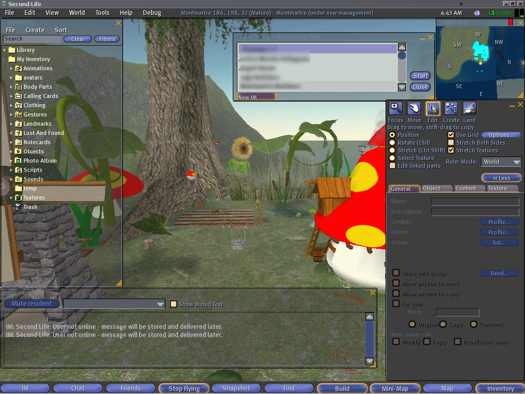
SL allows various parts of the user interface (UI) windows (inventory, chat history, IM, minimap, object edit, etc) to snap to other windows and the screen edges, but they cover up part of the 3D pane, obstructing the view, and making the whole interface seem claustrophobic. I think a better, optional, design would to have the 3D pane resize according to how the windows are docked (like most Windows UIs work). This is how Active Worlds' interface works (mostly) and it keeps things uncluttered (but could still use some improvement). SL's bottom toolbar (IM, Chat, Friends, Fly, Snapshot, Find, Build, Mini-Map, Map, and Inventory text buttons--which I think should, optionally, be icons with tooltips to GREATLY reduce the toolbar's width and perhaps positioned elsewhere) already exhibits this behavior but it's not enough. Transparent windows help, but the active window loses it and becomes solid. For example, my screen resolution is 1024x768 and I have the inventory, IM, and minimap windows open all the time ( screenshot) and even with the inventory window at its minimum width and the IM window 5 rows high, this blocks a good bit of the 3D pane--worse with the object edit and chat history windows open. Since the inventory window can easily become very long, it is a prime candidate for dockability and 3D pane adjustment. The object edit window is expandable enough to warrant dockability too. SL could have a LOT more intuitive UI. Here are some ideas to improve the inventory window: - Reduce/enlarge height when folders are closed/opened so excess empty space is eliminated.
- Split into 2 panes: folders and files to make navigation easier and significantly reduce vertical scrolling.
- Reduce width to maximum folder/file name width (optionally within user-resized width--if inventory window width set to 200 pixels, don't resize beyond that but only within it).
- Remove excess space around "Clear" and "Filters" buttons or, better yet, create icons and use the titles as tooltips to make the buttons even smaller).
- Move the object coordinates "popup" ( X: ###.### Y: ###.### Z: ###.### ) data to the object edit window (to left of "More >"/"< Less" button, for example) so it can't be covered by other windows. The chat background opacity setting should also apply to it (if it's left where it is--but at least move it up flush with the top of the menubar).
The IM window is in particular need of a redesign: - Remove "New" from "New Instant Messaging" title (just "Instant Message" suffices).
- Separate groups and users (tabs?).
- Add column headers with group/user name and online/offline (for users; groups could have total # users in group online) status (checkmark?).
- Lose the "Start"/"Close" buttons. Double-click group/user to start chat and use the titlebar "X" icon to close windows.
- When a chat is started, lose the redundant titlebar with group/user name and "undock window"/close icons (which can be put in the main IM window titlebar).
- "Profile..."/"Close" buttons made into tooltipped icons ("Close" is redundant anyway; use the titlebar "X" button)--or just dump "Close" and keep "Profile..." (which shouldn't appear in group chats or have "..." since it isn't editable, per se, and would reduce button width).
- Lose the "New IM" bottom tab when no chats are open.
Better yet, combine IM and "Friends" window for IMs and resize it like the inventory window, dump the excess space between buttons (use icons instead), lose the "Close" button, show online users at top like IM window. User-specific buttons could appear when a user is selected and stay hidden, or disabled when a group is selected (or, instead of "Profile", open the group info ("Info" icon) window. |
|
Eep Quirk
Absolutely Relative
Join date: 15 Dec 2004
Posts: 1,211
|
03-23-2006 12:41
No comments?
|
|
Draco18s Majestic
Registered User

Join date: 19 Sep 2005
Posts: 2,744
|
03-23-2006 13:34
I think that if they could be dragded outside the SL window, it'd be much better.
Then you can actually resize the 3D plane yourself to fit inside your out-docked windows.
|
|
Eep Quirk
Absolutely Relative
Join date: 15 Dec 2004
Posts: 1,211
|
03-23-2006 20:22
Er, that's what I'm proposing, only the 3D pane should automatically resize relative to the docked windows. Check out Wells Fargo's Stagecoach Island (which uses Active Worlds 4.1) to see how this would work--and with dockable/hideable window tabs: 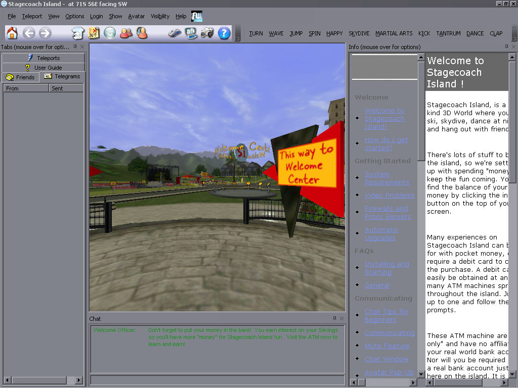 And with maximum 3D pane: 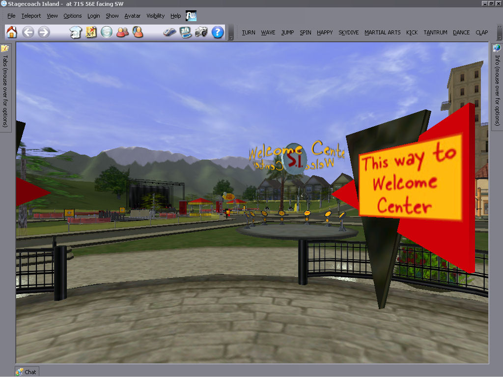 |
|
Nargus Asturias
Registered User

Join date: 16 Sep 2005
Posts: 499
|
03-24-2006 01:09
Hm...honestly...I don't like their interface design at all. It give me so much Windows Application look. It look so very simple because every other windows program use it and has much less uniqueness and creativeness in itself. Unless you just want to show the basis idea of it, of course.
_____________________
Nargus Asturias, aka, StreamWarrior
Blue Eastern Water Dragon
Brown-skinned Utahraptor from an Old Time
|
|
Eep Quirk
Absolutely Relative
Join date: 15 Dec 2004
Posts: 1,211
|
03-24-2006 01:22
Obviously, SL doesn't have to necessarily LOOK like a standard Windows UI (though I would like an option for it to since I prefer that look). A proper skinnable UI could still retain dockable/tabbable windows while still looking however the user wants. I just like how Active Worlds 4+'s interface can get out of the way easily, allowing the 3D pane to expand as near-maximum as possible given AW runs in a window.
|
|
Argent Stonecutter
Emergency Mustelid

Join date: 20 Sep 2005
Posts: 20,263
|
Skins...
03-24-2006 08:39
No further comment seems necessary. |
|
Dianne Mechanique
Back from the Dead

Join date: 28 Mar 2005
Posts: 2,648
|
03-24-2006 09:03
From: Argent Stonecutter No further comment seems necessary. IMO skinnable interfaces are just a way of avoiding designing a working interface. Lowest common denominator design never worked anywhere else, why should it work for UI's? And the original proposal on this thread (as far as I can understand it), makes no sense to me at all. It seems to be that the OP is saying that the extra window panes get in the way of the 3D pane, so the solution is to make the 3D pane smaller and have the extra panes around the edge? I don't see how that is any different, so I think I must have just not understood what it is that is being suggested here. (aside from the various detaily little improvements to boxes and so on, most of which sound okay if possible). Seems to me that this idea would only make sense if your 1024x768 window was not full screen but floating on another much larger screen, yet the screen shot posted seems to be full-screen. If that's the case though, then it also makes no sense to change the UI to accomodate the few players that have that kind of realestate. |
|
Charlie Omega
Registered User

Join date: 2 Dec 2002
Posts: 755
|
03-24-2006 10:02
I have proposed something like this repeatedly in the past for dual monitor environments. Where all windows can be "undocked" from the SL UI and dragged to the 2nd monitor. But it seems it was turned down by the LL dev team. We have not seen any results in this idea from them and my first suggestion of this was back in beta. Subsequent suggestions resulted in insults from a few in the community, so I give up...... Almost seems worthless to feature suggest anything anymore, as.... 1) It wont get implemented if it isn't cost effective to them to spend time on (regardless if it would make SL more appealing....and therefore allow for more possable paying clients heh) 2) Getting no support from the rest of the community and sometimes getting annoying or insulting replies if one doesn't like the fact that one even brings up a suggestion they don't like. 3) It seems that if LL can't seriously take obvious steps to improve areas in their client that users desire. That obviously will add to the "sellability" of SL as a whole. Then why should we waste our breath, they obviously have it under control and know whats best......(sarcasim alert). Anywho, aside from the suggestion seeming kinda over technical and vague but readable I agree ")
_____________________
From: 5oClock Lach With a game based on acquiring money, sex, and material goods, SL has effectively recreated all the negative aspects of the real world. Mega Prim issues and resolution ideas.... http://blog.secondlife.com/2007/10/04/second-life-havok4-beta-preview-temporarily-offline/
|
|
Eep Quirk
Absolutely Relative
Join date: 15 Dec 2004
Posts: 1,211
|
03-24-2006 13:04
From: Dianne Mechanique And the original proposal on this thread (as far as I can understand it), makes no sense to me at all. It seems to be that the OP is saying that the extra window panes get in the way of the 3D pane, so the solution is to make the 3D pane smaller and have the extra panes around the edge? I don't see how that is any different, so I think I must have just not understood what it is that is being suggested here.
Seems to me that this idea would only make sense if your 1024x768 window was not full screen but floating on another much larger screen, yet the screen shot posted seems to be full-screen. If that's the case though, then it also makes no sense to change the UI to accomodate the few players that have that kind of realestate. Did you see the Active Worlds 4.1 screenshots I posted links to, Dianne? (I'd post them IN the thread as examples but the IMG code has been disabled...again...randomly...in certain forums.) That is what I'm talking about. Like AW's tab window (with contacts, telegrams, etc) now hides/unhides (I'd like an option for it not to slide-animate tho) and can be "pinned" (where the 3D pane adjusts itself accordingly so the tab pane doesn't cover it permanently). This could be done with SL's inventory, chat history, object editor, script editor, etc windows. The point is to maximize the 3D pane without having it cluttered up and covered by other windows. Check out Stagecoach Island and play around with AW 4.1's interface. |